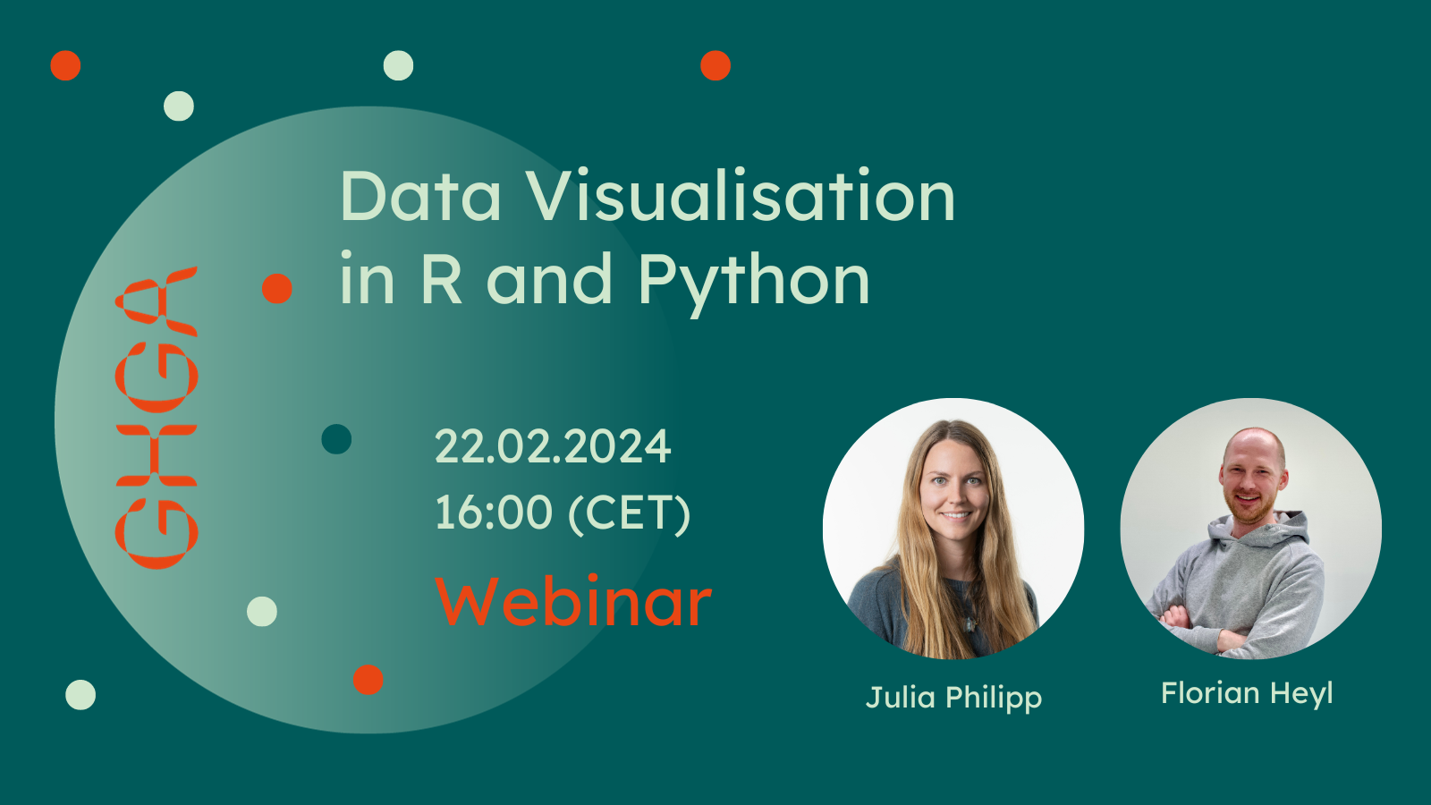
Webinar: Data Visualisation in R and Python
- 22 Feb 2024
Effective communication of scientific results relies heavily on good data visualisation, whether we aim to communicate with a lay audience or other scientists.
In February, we presented an introductory webinar about good data visualisation practice and techniques. This month, we would like to follow up with a more practical session, teaching you the basics of data visualisation with both R and Python. We will use an example dataset to demonstrate packages like base R, ggplot and plotly in R and ggplot, matplotlib, plotly and seaborn in python.
This webinar aims at early career researchers, clinicians, bioinformaticians and everyone working on or interested in communicating scientific results through meaningful visualisations. We recommend a basic understanding of either coding language and jupyter for getting the most out of this event.
The seminar will be given by GHGA workflows expert Florian Heyl and GHGA Training Coordinator Julia Philipp.
The event is in English and will be held on 22 February 2024, 16:00 CET (available afterwards on demand). Attendance is free, but we ask for registration.


